Event brand design
2023

2023
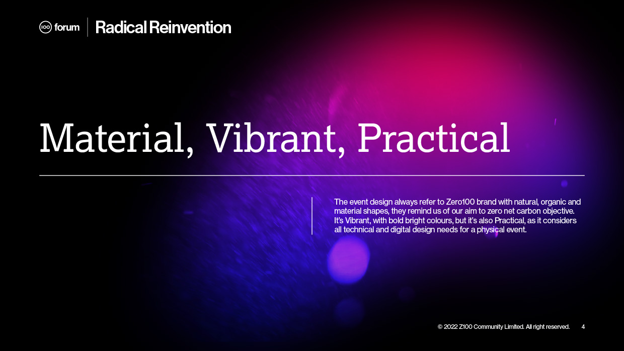
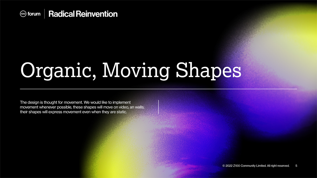
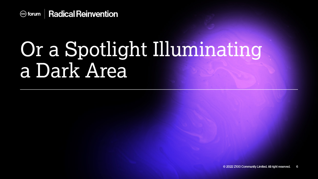

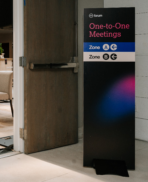
The design team initially presented a concept featuring animated organic elements infused with vibrant color gradients. However, leadership felt the colors were too overwhelming, and the concept received a lukewarm response. I took the lead on revising the design, proposing to shape the organic animations while keeping the rest as black negative space. I developed a system of six distinct shapes, each dominated by a different color, which were used to identify various event areas and guide wayfinding categories.

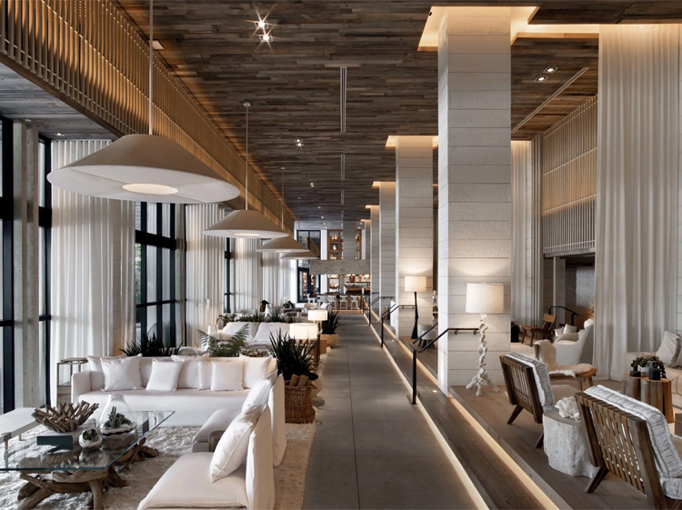
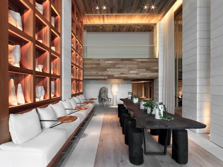
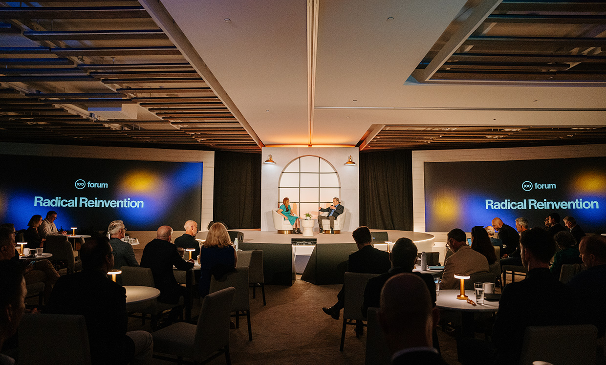
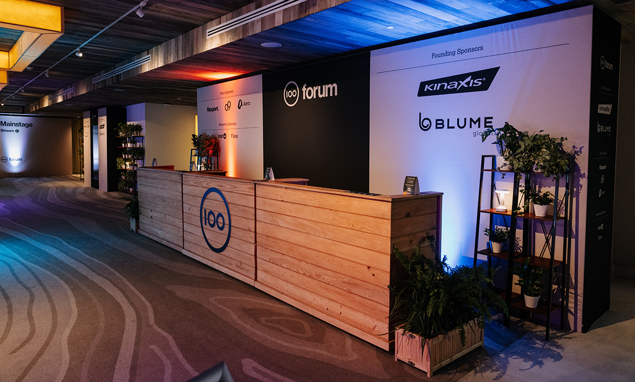
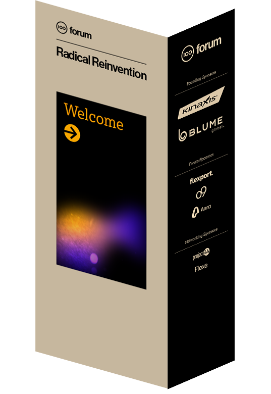
The hotel was selected for its commitment to sustainability, both in its furniture choices and overall management. The venue’s tones featured soft, natural colors. Our stakeholders requested that the wayfinding and stage design align with this aesthetic, so I chose a black and beige palette to complement the existing environment.


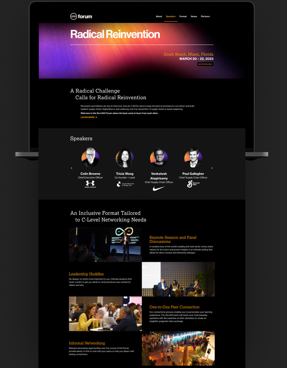
The digital space should have conform to Zero100 digital aspiration, with bright and vibrant colors,.
Designed in Figma, built using WordPress and Elementor
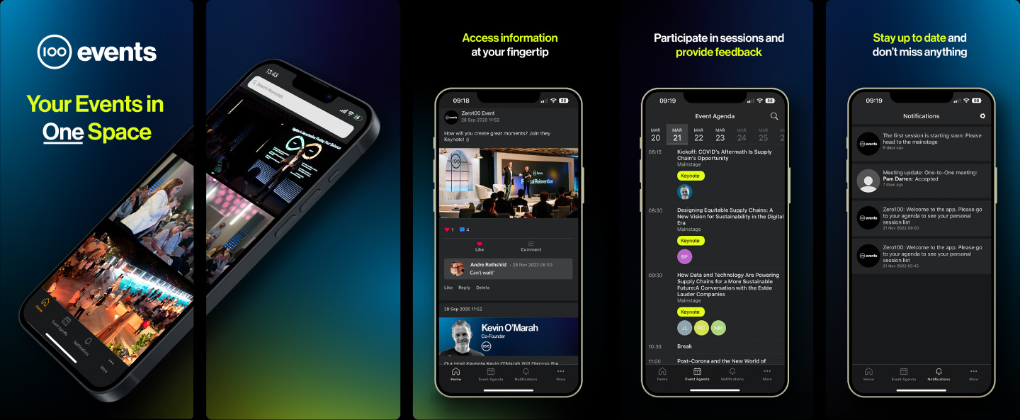
The app, a SpotMe product for events, was managed by the Operations team. I was responsible for creating all necessary graphic elements, including the app store visuals for both iPhone and Android platforms.
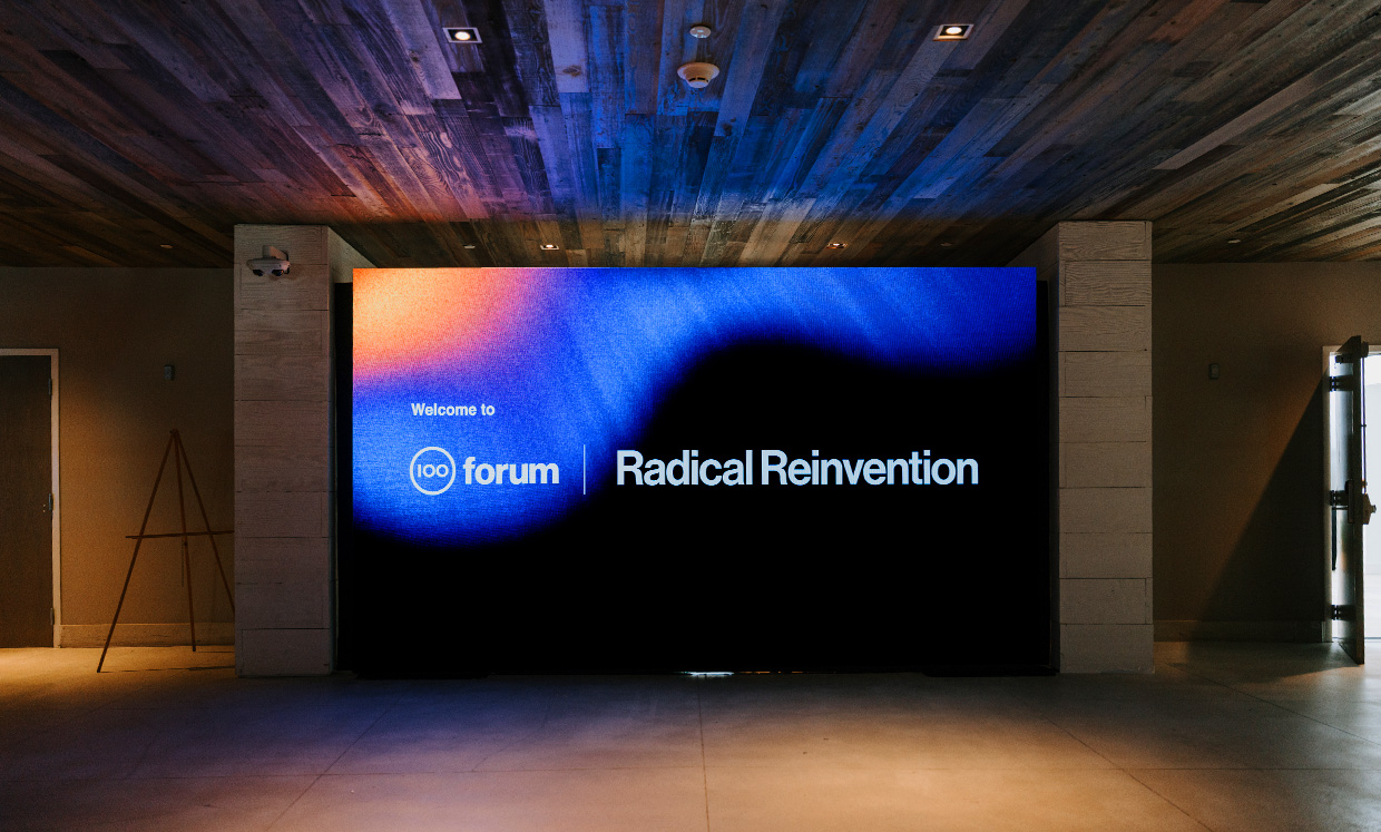
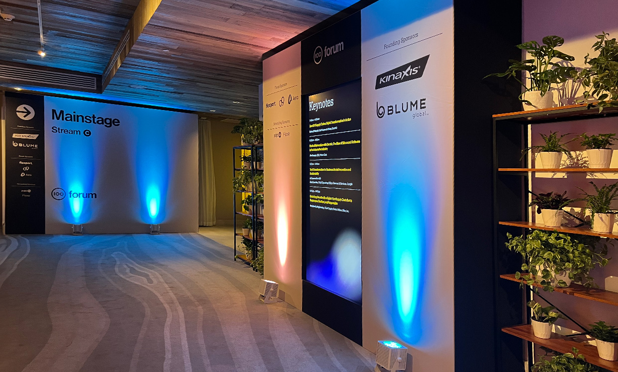
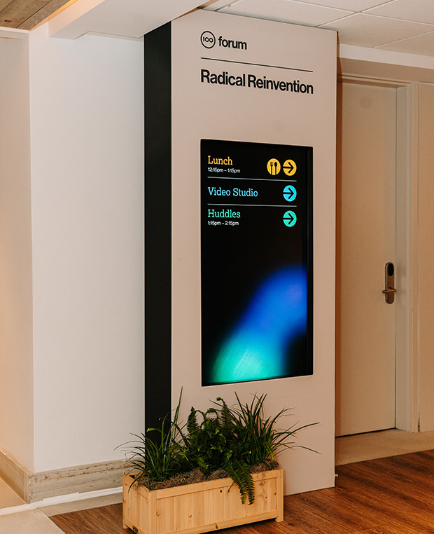
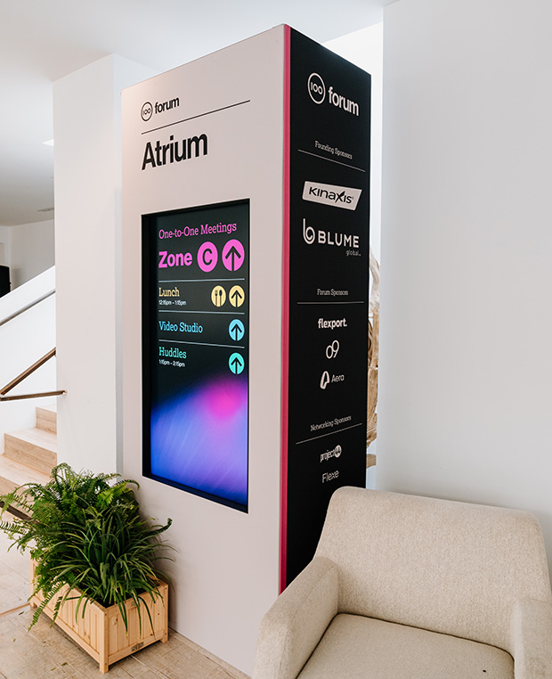
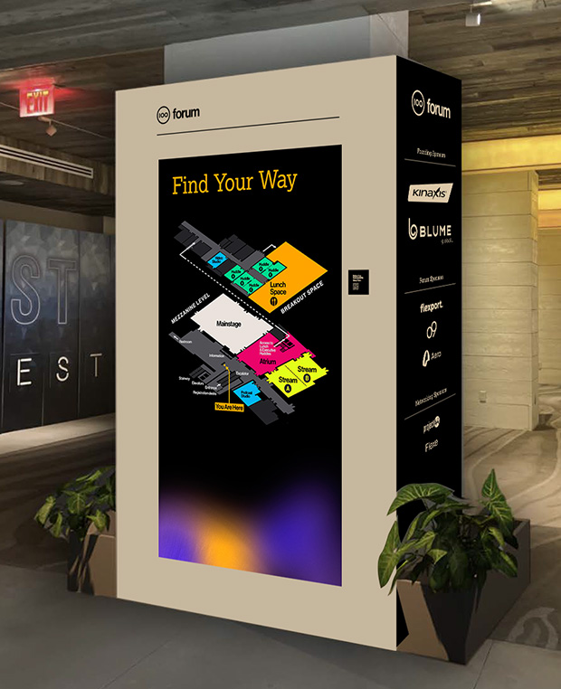
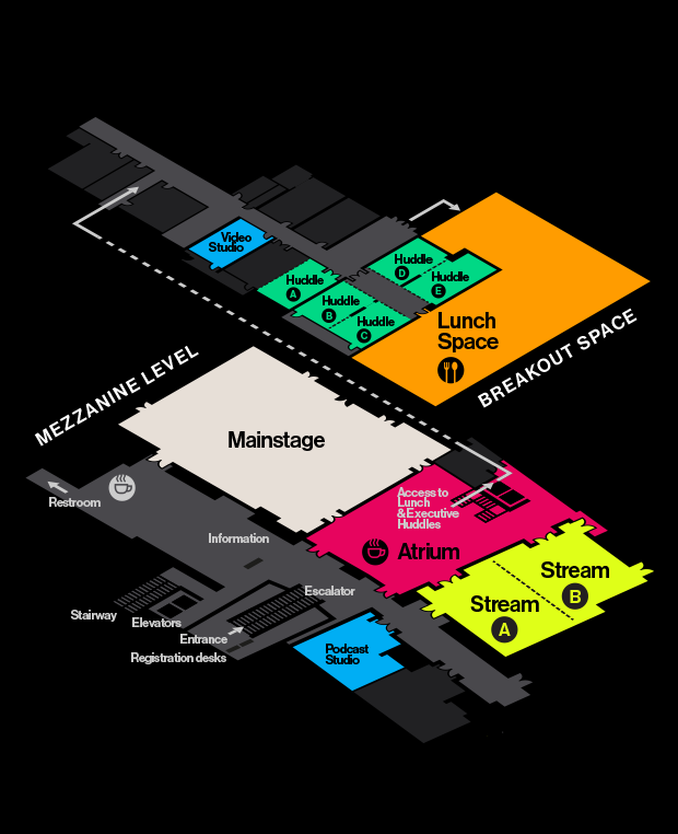

The wayfinding system featured a central screen displaying real-time information. Each area was color-coded and assigned a unique shape for easy identification. You can view the actual animation by clicking the link on the screen to watch it on YouTube.