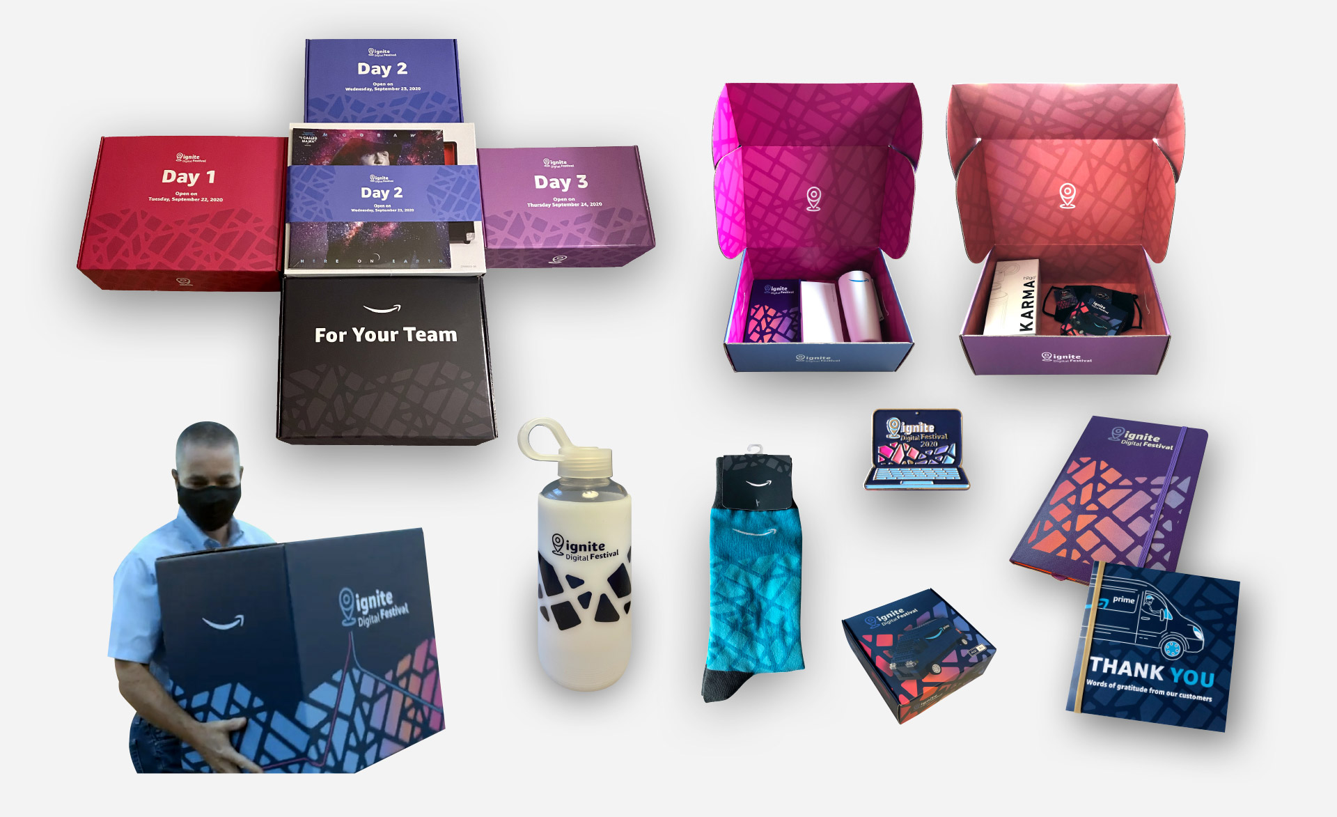
I was tasked with reimagining the original Ignite logo to reflect the celebratory spirit of the event. Below is the final result. I utilized the boldest version of the Amazon Ember typeface and intentionally misaligned the text to evoke a dynamic, ‘shout’ effect, adding energy and excitement to the design.


Electric Pink
WCAG 2.0 contrast ratio:
AAA
AA
Contrast:
5.2:1
AA
Contrast:
3.94:1
Large text
18pt+ Bold
24pt+ Light


Electric Blue
WCAG 2.0 contrast ratio:
AAA
AA
Contrast:
4.57:1
AA
Contrast:
4.48:1
Large text
18pt+ Bold
24pt+ Light


Pattern building module structure
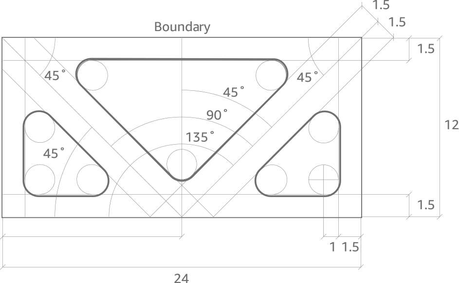
Pattern modules
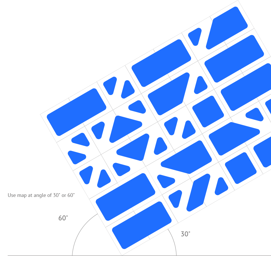
The 8 modules can be used singularly as icon or symbol or can be combined together to form a pattern that remind of a city map.
Event Screenshots
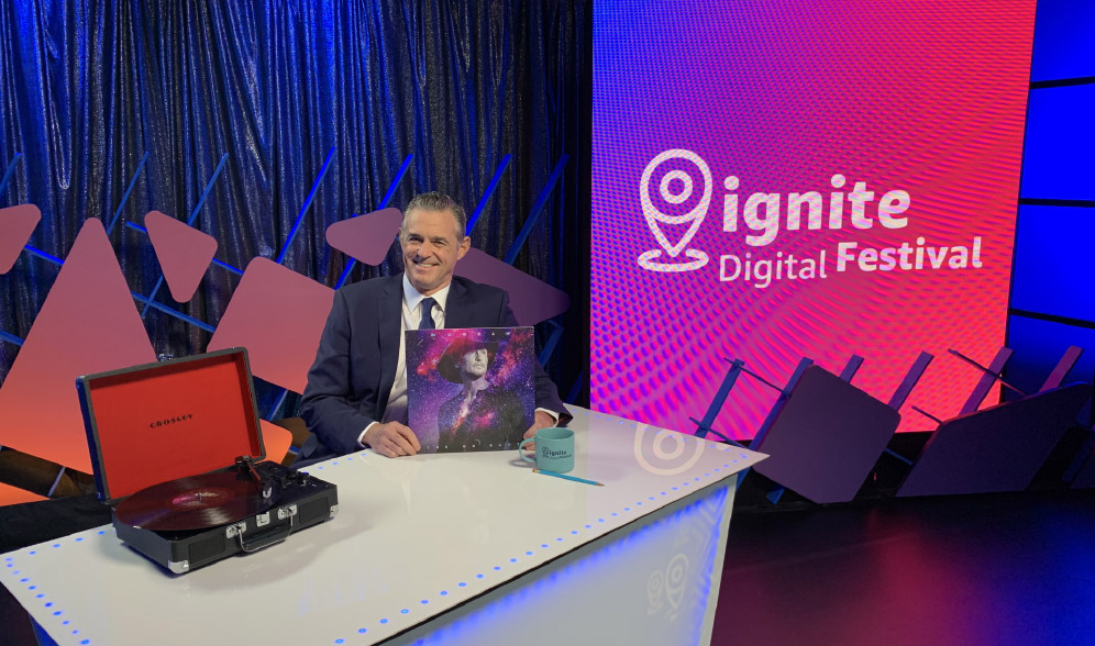
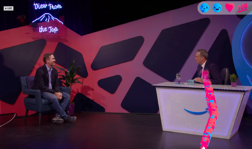
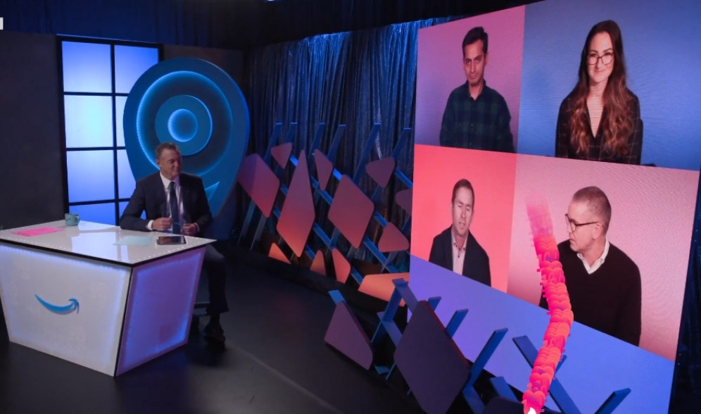
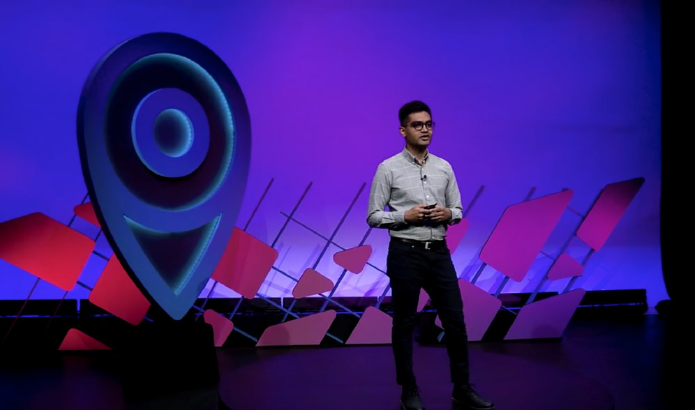
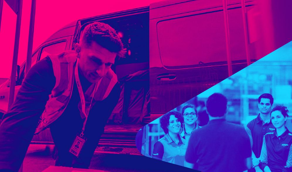
Photo treatment



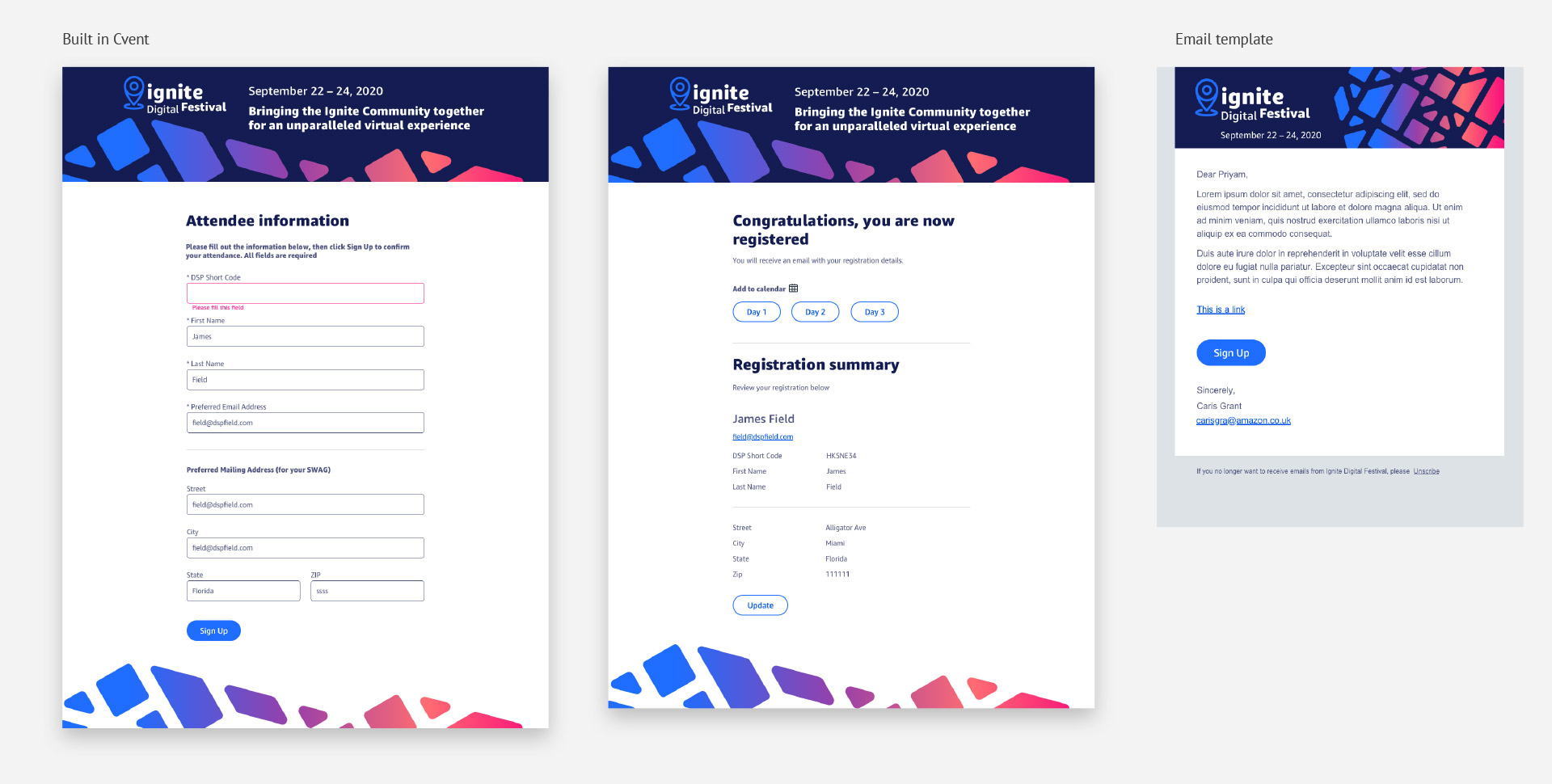
Event registration platform design
Swag
