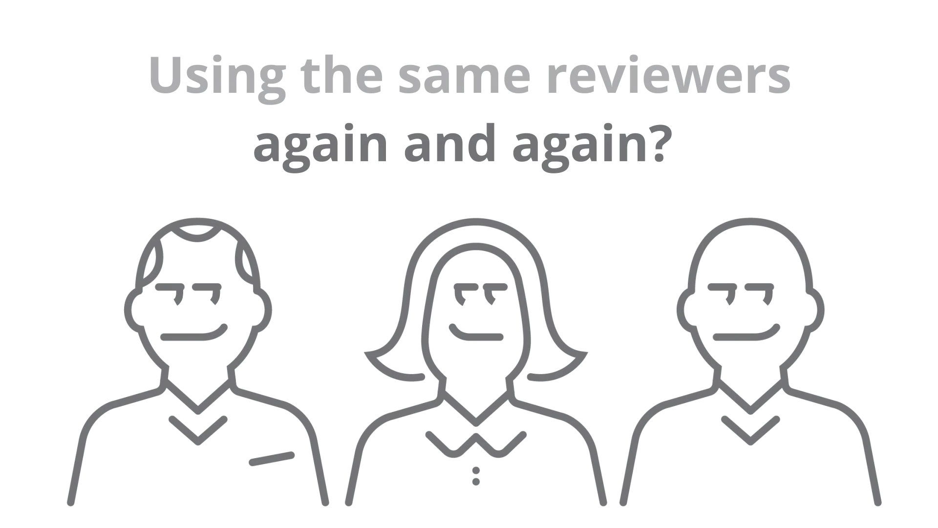
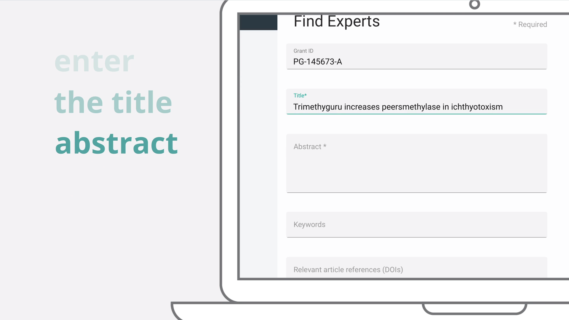
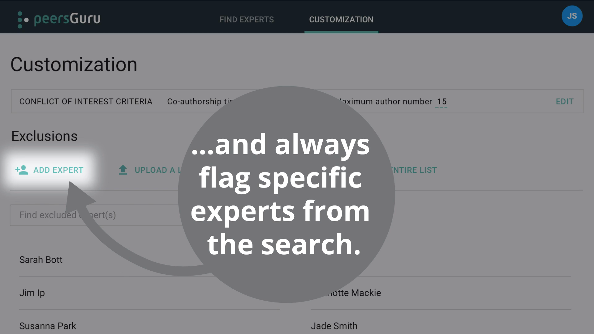
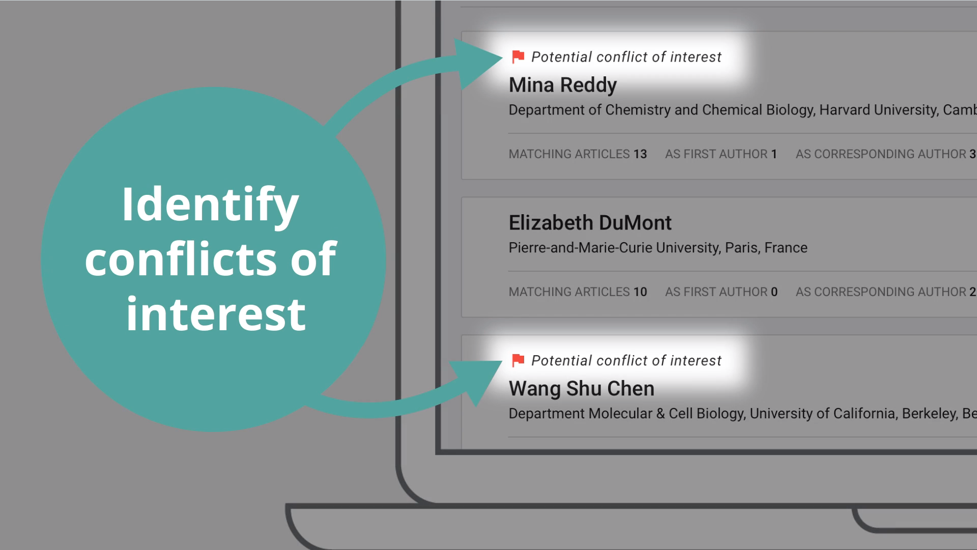
I was provided with guidelines on the tool’s capabilities, the features the stakeholders wanted to highlight, and a draft of the messaging. From there, I developed a storyboard, refining the messaging and selecting visuals that reinforced the brand identity.
Additionally, having designed the company logo, I integrated its core metaphor—dots representing peer-reviewed papers—into the animation. These dots expanded to symbolize individuals working collaboratively to solve researchers’ problems, creating a cohesive and meaningful visual narrative.


